Deterministic Queue Visualizations

1. Background

Queues are ubiquitous. From cafeterias, bus stops, to daily traffic, customers have all experienced waiting, and expected to be served as soon as possible ("Demand"). On the other hand, service providers are searching for ways to improve their efficiency ("Supply"). To capture the nuances between demand and supply, simulations can be run to optimize the queuing system. Under the hood, there are many complex equations governing various scenarios. However, they can be greatly simplified without losing much accuracy in calculation. On this page, we will gain some intuitions about queuing system.

2. A Brief Description of Queuing System Modeling

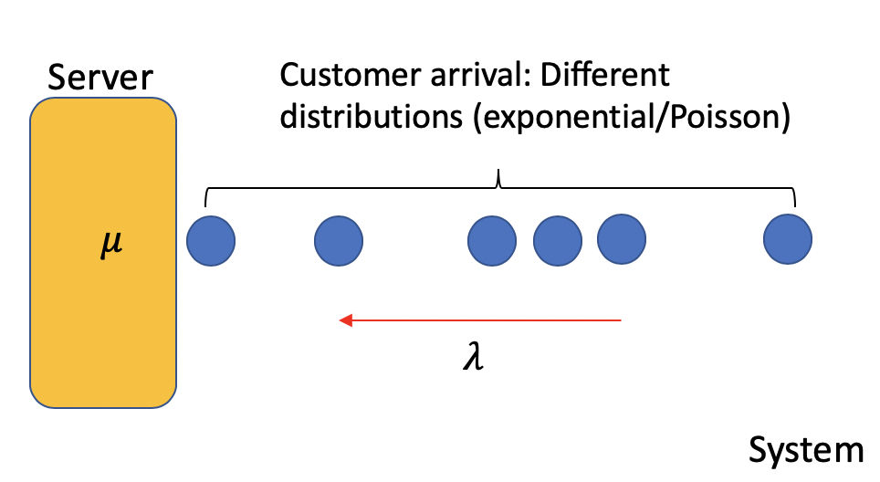
The figure above illustrates a typical queuing system with one server. Customers arrive in a random fashion with expected rate λ, whereas the server processes customers at μ. Such randomness can be approximated stocastically using either exponential or poisson distributions. For large customer flow, such as car traffic at a highway bottleneck, uniform distribution can be applied. In this case, the queuing system is deterministic.
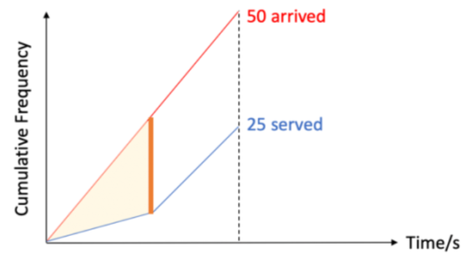
3. Intuition

A deterministic queue with one server can be interpreted as a cumulative frequency graph shown in the figure above. We hypothesize that two counters are placed on both ends of the queuing system. One records the total customers arrived, the other records total customers served. Both counters start, capture trend, and stop simultaneously.
Key quantities can be derived from the figure above. The slope of red line represents arrival frequency λ, whereas that of blue line indicates service frequency μ. The vertical distance between two lines is the queue length, the horizontal means the time taken for a customer to exit the queue. The area enclosed by two lines is the total wait time. When divided by time elapsed, the average wait time can be computed.
Another meaningful intuition is that the cumulative service count (blue line) can never exceed arrival count. This is equivalent to conservation of energy, where the amount of people entering the system ("energy input") is always greater, or equal to the number exiting the system ("energy output"). The "absorbed energy" is equivalent to the number of people waiting in line.

4. Let's Visualize

We can reinforce our intuition by running the mini-simulation below. This is a dynamic visualization, in which three parameters (arrival and service rates, plot density) can be selected via sliders in real time. Meanwhile, you can look at how the key quantities change from "Queue Status". If you wish to clear the charts and retart from scratch, simply refresh your browser.
Change parameters any way you want. Have you observed any unexpected trends?

Click to Start/Stop Simulation

Start

Adjust Arrival Frequency

(# of People / sec)

Adjust Service Frequency

(# of People / sec)

Plot Density

(Plot Dot In Every x Second)

Queue Status

Arrived:

  • 0
  • Served:

  • 0
  • Queued:

  • 0
  • Average Wait Time:

  • 0